Over the last week I had some fun making a couple of diagrams for our World Congress of Soil Science 2022 poster. Not going to lie, it took me a while to put them together but I’m glad I took on the learning curve. I decided to use Inkscape create my images. I thought it might be useful if shared some of the things I learnt on how to create a diagram in Inkscape, so if you fancied using Inkscape too, you’ve got somewhere to start from. I’m definitely not an expert, not by any stretch of the imagination, but from one novice to another this is how I approached it.
This is for you if you need more than the free version of BioRender, which is amazing but is limited in output quality (dpi) and with what you can do in the images. There isn’t that many options in BioRender for plants and roots. By doing it myself I found some cool techniques that really look great for plants and roots.
Inkscape overview
Inkscape is a completely free graphics program in a similar league of the paid for alternative Adobe Illustrator. Don’t let the ‘free’ bit give you an indication that it’s any less capable. It is an incredibly powerful graphics editor, most of which is well beyond my understanding. Inkscape will probably do everything I (and you) will need to do for the purposes of research illustration. If occasional dabbling is what you’re after, and an upgrade from Paint, then Inkscape is perfect.
It works by using SVG files – also known as scalable vector graphs – which are a much better way to create images than a JPG or PNG for example. It means that you can scale up and down as needed without a loss of quality. Essential for producing large graphics for A0 size posters.
Equipment I used
I must make a disclaimer before I start though; I do have a graphics pad (-> H950P by Huion). I did find this super useful for creating the plant leaves. This is due to the fact it can detect pen pressure so it works well with the ‘Min’ and ‘Max’ functions of the pencil tool. A normal mouse isn’t pressure-sensitive so having a graphics pad was essential to get the leaf tapered blade effects. There’s probably ways round this but if you’re super keen, then it might be a sensible investment. Other than this though, I didn’t really feel the need to have one – the mouse and keyboard did the job just fine. And I would recommend an actual mouse over a touch-pad. I would have torn my hair out with a touch pad.
(Though I’ve just had a thought – could you use a stylus and a touch pad as an alternative of a graphics pad?! I don’t know the answer to that question…)
I managed to create my Inkscape diagram on a standard issue university laptop. The laptop did however start struggling a bit towards the end. Nothing major, but enough to not want to create something too much bigger.
Getting started to create a diagram in Inkscape
There are a million and one Inkscape tutorials on the web. I personally started with its inbuilt ones. They were enough to get me going with the basics. I only really did the first three, then skimmed through the rest. It probably took me an hour or two to work properly through these.

These got me understanding the basic aspects of Inkscape functionality and navigation. So start there and then the rest of this blog will make more sense. I’m not going to re-invent the wheel and write the basics here. Below I’ve highlighted some particularly useful things I learnt and/or are worth highlighting specifically.
But first, draw it out on paper
Before you go anywhere near creating your diagram in Inkscape, draw your image out on paper. What do you want to show? What do you want to include or exclude? What about the dimensions? I drew out several versions to make sure that everything fit together.

Setting image size in Inkscape
This took me a while to work out… With your above sketch in tow, work out the image dimensions and set them in File -> Document Properties. You’re welcome. Save and remember to save regularly. It’s too easy to get used to programs which make a lot of effort not to lose your work and/or are stored on the cloud. However Inkscape has none of the back-up functionality of Microsoft Office for example, so save it regularly.
Layers
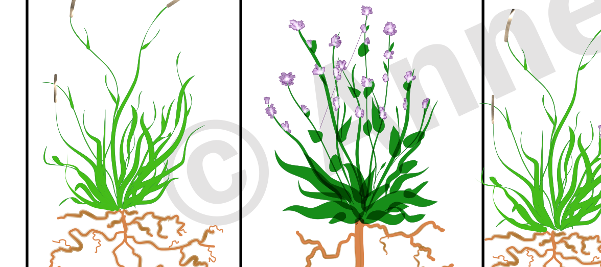
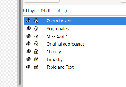
The tutorials didn’t cover layers which came as a surprise. These were something I learnt about back when photography editing was something I dabbled in. Whilst not essential to using Inkscape, they improve its functionality massively. In fact to create a diagram with any software, they are essential. With layers, it’s as it sounds. You use different layers in your image, and the final image is a blend of all these together. So for example, my image had 7 layers, one for each major component. I actually started with another layer, which was a sketch layer to outline what I wanted where, making sure my pencil and paper sketch looked OK digitally.
With the snip below, you might be able to see why layers are useful. The ‘eye’ icon, means you can hide the layer so you can’t see it. Useful if you don’t want distractions or if you want to check what’s in a layer. The lock function is incredibly useful as this ensures that you can prevent any changes to another part of your image whilst working on another. Working on one layer, is a one stop trip to frustration. It’s harder to select areas of an image and move them around, easier to accidently delete bits and harder to make later edits. So I recommend you get to know layers.
Select all ‘like’ areas
Selecting like areas was covered in the tutorial, but one I found it super useful when creating the diagram. That’s the option Edit -> Select Same. It’s basically when you want to select all areas of a layer that have the same properties e.g. colours, outline (stroke) etc. I found this useful when I was trying to blend the leaves and flowers.
![[Pasted image 20220720055231.png]]

The ‘clip’ function
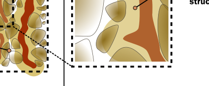
I found the ‘clip’ function useful. It meant that I could ‘zoom’ into a part of image, whilst still retaining all the paths, so I could edit them separately.
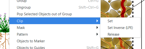
I couldn’t tell you the ins and outs of clips vs masks, but have a play and see what they can do for you. Inkspace doesn’t delete the original cropped part so if you decide at a later date that you want to zoom in a bit more then that can be changed.

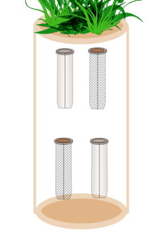
The image above also made use of the ‘snapping’ function whereby the dotted zoom lines are ‘snapped’ to the relevant corners ensuring everything is connected. Another thing I’ll mention about the ‘zoomed’ image above is the round-ended pointer. A while ago I watched a webinar run by Shiz Aoki (CEO and co-founder of BioRender) and she highlighted the difference between the use of a pointy arrow and a rounded arrow. A pointy arrow indicates directionality whereas a rounded arrow (or other non-triangular shape..) should be used to add information. It’s hard to get over the scientific ‘precision’ provided by a point, rather than the general ‘accuracy’ provided by a non-point, but hey it makes sense.
Getting to know the ‘Path’ functions
I haven’t yet cracked how paths can join together yet, but it’s something I need to spend some time on when I create more diagrams in Inkscape in the future. Take the core setup I was trying to draw below. The top worked out how I wanted it, but the base, I couldn’t get to join properly so I just had an outline. It’s perfectly possible, I just haven’t worked it out yet!
The most amazing function, mentioned in the tutorial was that of increasing the outset of a path using ‘ctrl + )’. This made for some super cool root-soil interface ‘impact zones’. I altered the opacity of the new object (and sent it to the background) and what you end up with is a perfectly proportional expansion of the original shape (i.e. the root). This was super cool and I was so happy with this amazing function!
Play about with gradients
I also loved trying out gradients. They give a much better impression of 3D than a flat colour. I used them in making the tubes above and for the ‘aggregates’ in the soil. I even created a gradient outline for the roots of the plants, to give an impression that the central root vascular bundle tends to be more dense than the outer cortex.. and that the impact of roots on soil is not constant across their length.
It didn’t quite work out how I wanted it to, but it was a cool effect to try. I think I would have been better using the outset function mentioned above. However this has so much potential!

Final comments on using Inkscape to create a scientific diagram
I still don’t use them enough, but I did find learning the keyboard shortcuts for things was pretty helpful. Still, it’s all work in progress. There was stuff I learnt at the end which would have been useful to know earlier in the process. It’s all part of starting creating simple diagrams in Inkscape for your research. But ‘ah wisnae gaing back tae do it again’ at that point! There’s only so many hours in the day. I hope that you find this useful. Is there anything else I should have included here? What are your favourite functions of Inkscape? I’d love to know if you found any of these techniques useful to create your own diagram in Inkscape.
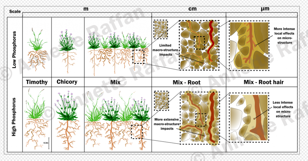
And final, final, here’s what I created:
All drawings and text copyright of Annette Raffan – please do not reproduce without permission.
Coffee I’m drinking: Horsham Coffee Roaster: Peru, Gregorio Esquen, Lot 1 – I also fixed my Moka pot with PTFE tape, so it works properly now!
Books I’m currently reading: Strong Female Lead: Lessons from Women in Power by Arwa Mahdawi and The Highly Sensitive Person by Elaine Aron
Previous post: Five Things I Wished I’d Known as a New PhD Student
2 thoughts on “How to create simple diagrams in Inkscape – a guide for scientists”